Creating the MVP of the first ride-sharing app of Paraguay
Project Overview
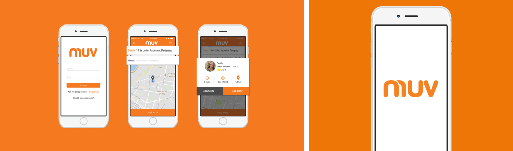
MUV is a ride-sharing app born in Paraguay before Uber was available. When the project was just beginning i was part of a team of consultants that had the goal of articulate an MVP so the idea could be tested and visualize the biggest challenges.
This project was incubated by miut.company, an innovation laboratory based in Paraguay, which i co-founded. I was personally the project leader for the first 2 years fo Betacards. We focused on perfecting the product (methodology + experience + design) and also iterating business models so it can scale to LatAm, and then the rest of the world.
My Contributions
I was in charge of the initial branding and the design of the first screens. One constraint was that they were using a template for the app so from a UX perspective i didn't have much to change in the interactions, and which screens, so it was more of a aesthethics addition, some customization and a goal of making it feel more local to the users
Description
This is one of my favorite projects because it was one of the first ones that intersected technology and design, and i was just back from the New York course i made. There are a lot of things i would do different now, but the fact that i could implement in real life everything i had learned so far was a big deal for me. That in itself is the best kind of learning experience in my opinion.
In terms of Branding my approach was a friendly and simple use of the letters of the name, taking advantage of it being so short. I think a three letter name is golden. It was intended for a temporary use (just for the MVP) but after it started gaining some traction they decided to keep it, just after making some fine tuning.
On the UI side i just tried to tweak a little bit of what i could. Developed some icons and focused on consistency (since it was a template made for a different thing) I paid a lot of attention to the copy. Making sure the user knew what to do every step of the way. To do so we arranged some tests with users in a controlled environment where we could correct some of the bigger issues. For instance, in one of the first iterations if the user didn't ranked the driver the app got stuck there, if the user just closed the app after the ride, and then a few days later opened the app again and found that screen it would be very confusing. So we came up with a simple explanation that gave more info about that trip, and why it was important to rank the driver (this was particularly important in the early days of the project)
The fact that what we built (with all it's errors) enabled the project to keep going and grow to this day, is what makes me think of as a success