2024 · Product · ecoPortal
Redesigning Register Tables
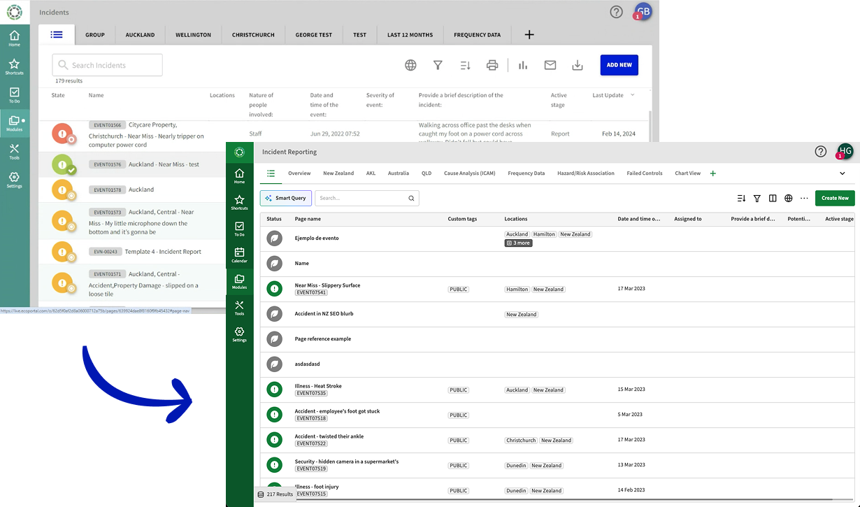
The view where health and safety teams track incidents and audits, rebuilt from Angular to React.
- Problem
- Tens of thousands of records behind filters that gave no context and only matched exact text. Changing which columns you saw meant asking our services team.
- My role
- My first project at ecoPortal. I led it end to end: research, design, handoff, and design QA on the React rebuild.
- Outcome
- The first release was opt-in. Within a month over 60% of people had switched, most of them in the first week.
Context
ecoPortal is used by large, regulated organizations across New Zealand, Australia and the UK. Each one builds its own registers for incidents, hazards and audits, with its own templates, stages and fields. Register Tables are the list over all of it: where a health and safety manager checks who hasn’t completed an audit, or pulls an export for a report.
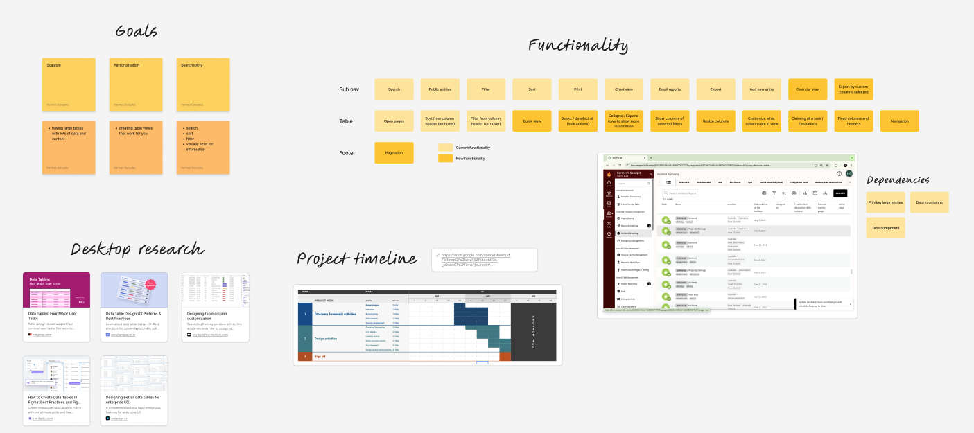
The new table was a React view running inside the Angular app, and it had to do everything the old one did before anything new counted. I started with support, Customer Success and the implementation team, then interviewed customers, mostly H&S managers, and ran a design jam with the product team.
Decisions
01
People build their own views
Managers kept asking for control over their columns, and Customer Success found people downloading exports just to see the ones they wanted. Users now pick and order columns and save them as views, shown as tabs and shared the way dashboards already were. Some registers need fifty columns, so horizontal scrolling is a given, not a setting.
Instead of: One default layout, set up by services.
02
Filters show where each field comes from
Fields in the filter picker are grouped by template and stage. When templates share a field, it appears more than once. I accepted that, because the goal was context, not restriction. A field type selector stayed for people who knew the old list.
Instead of: One flat list, where every “Date” looked the same.
03
One rule for every operator
“Is”, “has” and “contains” mean the same thing everywhere. Text matches on “contains”, and fields with several values get “has any of” and “has all of”. Consistency came before coverage, so a few field types waited for a later phase.
Instead of: Full coverage for every field type in the first release.
04
Phase one replaces, the rest waits
I framed the table as the index to a filing cabinet: where you find things, not where you do the work. Bulk actions, inline editing, a calendar and pagination waited. Exports stayed central, because downloading was what customers asked about most.
Instead of: Shipping the design jam’s full wish list in one release.
Results
- Over 60% of people switched to the opt-in release within a month, most in the first week.
- Strong positive feedback from Customer Success.
- The filter component went into the design system, and I went on to design the reporting dashboards.
“My reporting's gone from a basic pie graph to… trend analysis across a whole entire year, which just gives way more insight. I love the new dashboards, and they're really easy to put together as well.”
Looking back
Test with customers before handoff
Our usability testing was internal. Questions I carried into release, like how someone with twenty templates in one register would take the new grouping, were ones customers could have answered.
Write the reasoning down early
In the squad retro I wrote that I should record the thinking behind decisions as I went and share it async, instead of saving it for the final presentation.